Revivals
Seb McLauchlan, 21 May 2023
Mergenthaler Linotype Spartan Book, produced in 1939, scanned from Jaspert, Berry and Johnson’s Encyclopaedia of Typefaces, Cassell, 2001
It’s 1974. My eighteen-year-old mother is on stage in a conference centre in Manila, being interviewed by the presenter of the Miss World beauty pageant. He asks her to compare American boys and Filipino boys and tell the audience which she prefers.
It’s 1988. My father is on CAAC Flight 301, flying from Guangzhou to Hong Kong. As it descends at Kai Tak Airport, the plane clips the approach lights, overruns the landing strip, and crashes into Kowloon Bay. Fifteen people are injured, and seven people die. My father breaks out of the cabin and swims to the shore.
* * *
It’s 2010. Kevin Systrom and Mike Krieger are uploading Instagram to the App Store. It acquires one million registered users in two months and ten million within a year.
It’s 2023. I’m posting a carousel of photos on Instagram from a workshop I organised at the Kingston School of Art. The next day, I check its progress. It’s received 321 likes from my 3,907 followers. I worry about whether this is enough and feel ashamed that part of my self-esteem is located inside this app.
It’s 2011. I’m in the second year of a design degree at Massey University in Wellington. I discover type design through Kris Sowersby’s blog and am so overwhelmed I start crying. My father is holding me, slightly confused.
It’s 2012. My father is missing. Someone finds him sitting in the street, playing an electric bass guitar that isn’t plugged in. At the hospital, we’re told that he’s having a manic episode triggered by stress and some medication he’s on. It’s the third anniversary of his sister’s death, and he left his job over a year ago. Now most of his days are spent doing chores, cooking for us, and writing unsuccessful job applications. Weeks later, after he leaves the ward, I sit with him in the living room, and we hold each other’s hands. I’m feeling guilty because I’m choosing this moment to wonder how I will be when I’m his age.
It’s 2020. I’m sitting at my dining table in London crying, and Lyson is holding me. I’m trying to find the energy to continue drawing ABC ROM. I’ve spent over a year drawing the italics, and I can’t work for any longer than two hours a day before getting frustrated. A friend later asks if there is some form of automation that could assist with this process.
It’s 2022. I’m in the audience at the Fontstand International Typography Conference in The Hague. Noopur Datye and Sarang Kulkarni from Ek Type in Mumbai are delivering a presentation. One of their designs, Baloo, covers eleven scripts in languages that are used by over one billion people.
It’s 2023. OpenAI is releasing a new version of ChatGPT. I’m watching a Youtube video explaining how ‘latent space’ is a part of training a neural network. An example used in the video is a self-generating typeface.
It’s 2011. Lee Jensen is presenting a lecture on queer perspectives in graphic design to my class at Massey University. He surveys the persecution of queer and non-binary people throughout history and introduces many of us to the aesthetics of ‘camp’. He breaks down in tears as he explains that during the liberation of the concentration camps after WWII, many homosexual prisoners continued to be detained.
It’s 1981. My father is meeting my mother for the first time in the lobby of the Hyatt in Manila. He has been working there for a few months as an assistant manager, and my mother and her sisters are having a drink in the lounge.
* * *
It’s 1913. After years of disputes with his former business partner, T. J. Cobden-Sanderson is disposing of the matrices and punches of the Doves Type by throwing them into London’s River Thames.
It’s 1518. Italian type designer Francesco Griffo is being charged with murder by the court of Bologna for beating his son-in-law to death with an iron bar.
It’s 2015. I’m moving to London after getting a job as a graphic designer at OK-RM. Within the first week of living here, someone is stabbed outside my flat on Kingsland Road.
It’s 1932. English sculptor and typeface designer Eric Gill is finishing work on his statue, ‘Prospero and Ariel’, above the entrance to the BBC’s Broadcasting House. He is standing on the scaffolding wearing a long robe with no underwear, exposing himself to the employees entering the building below.
It’s 2020. After scaling the building’s façade, a man is smashing Gill’s statue with a hammer. Passersby are recording him with their iPhones.
It’s 2022. I’m cooking dinner, listening to Michael Jackson’s ‘Off the Wall’ album and singing along to the lyrics of ‘Girlfriend’.
It’s 1994. Ampersand is releasing an issue featuring an essay in which scholar and letterpress printer Alastair Johnston asks, ‘Do you have to be an asshole to be a good type designer?’
* * *
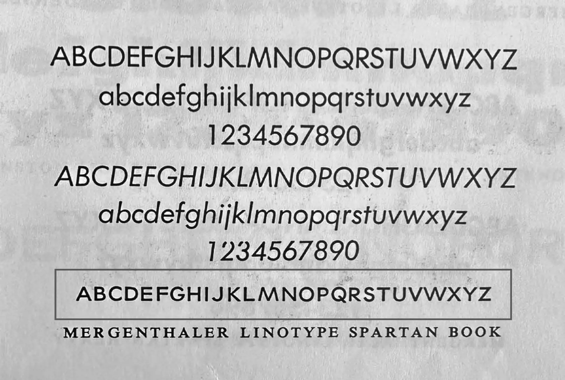
It’s 1939. John L. Renshaw is finishing Spartan for Mergenthaler Linotype Company.
It’s 1927. Paul Renner is finishing Futura for Bauer Type Foundry.
It’s 2018. Instagram hits one billion registered users.
It’s 2022. I’m finishing my work on ROM for ABC Dinamo. I download trial versions of Theinhardt from Optimo and compare them to test files of Söhne by Klim Type Foundry and a copy of Monotype Grotesque I took from OK-RM’s type folder back in 2019. I open Söhne Regular in Glyphs to measure the thickness of the capital G bowl and compare it against ROM’s. It’s two units different. I open Theinhardt Medium by François Rappo and try to discern his opinion. I squint my eyes to see if the difference is perceptible at small sizes. I wonder whether Kris and François will like ROM and if they’ll notice any of the similarities it has to their fonts. I wonder if they make these kinds of comparisons too—and if they don’t, what that says about me. I worry if I’ve been broad enough with my references. I wonder if anyone will comment on any future Instagram posts, pointing out the similarities between my font and theirs. I wonder if my reference folder of old typefaces from dead designers will be enough if anyone comes to audit my laptop. I wonder if I’ll be haunted by Günter Gerhard Lange and Morris Fuller Benton, and if John L. Renshaw slept well at night.
It’s 2022. Jean François Porchez is giving a lecture at the Fontstand conference on the ethics of revivals. In the course of the lecture, he publicly accuses a former employee of plagiarism.
It’s 2014. In New York, Tobias Frere-Jones is filing a lawsuit against his former business partner Jonathan Hoefler over the ownership of their type foundry. They will eventually settle out of court for an undisclosed sum.
It’s 2023. I’m lying in bed reading the summary judgement of a lawsuit between two type designers on my phone.
It’s 2019. A friend is interviewing me for a design blog. They’re asking me where I find inspiration and what guides my practice. I’m trying to explain that I don’t feel intelligent or well-read enough to have any specific philosophies that ground my work.
It’s 2021. I’m reading a royalty report for my ABC Dinamo typeface. I note that Parisienne cigarettes have rebranded with Ginto, which now makes up 94% of my total royalties for that quarter.
* * *
It’s 2015. Under the direction of designer Robert Green, the Port of London Authority’s diving team is recovering pieces of the original Doves Type from the riverbed of the Thames.
It’s 2019. I’m teaching a class at Kingston School of Art. For their first assignment, ’Gravedigging’, the students must revive a historical typeface.
It’s 2020. I’m meeting with one of my Kingston students on Microsoft Teams. The sound quality is bad, and their voice becomes distorted and robotic. Every time I talk, I’m sure I also sound like a robot. They are explaining how their anxiety has meant that they haven’t finished this week’s assignment. At one point, they stop talking, and I see tears running down their pixelated face. I suggest we meet face-to-face the following week when we’re back in the studio, forgetting that we’ll have to wear face masks and keep socially distant. After this call, I have another with an international student in Japan who has to take all their classes remotely. One of my colleagues tells me the university is charging this student the full international tuition fee. I calculate the time difference—10am in London is 6pm in Tokyo, so today’s class won’t finish until after midnight, Tokyo time.
It’s 2023. Kingston School of Art is raising its yearly fees to £9,250 for home students and £16,800 for international students.
It’s 2021. As an assignment for my Kingston class, I’m asking the students to organise, initiate and publish their own typefaces, with all proceeds going towards their degree show.
* * *
It’s 2014. I’m sharing a drink with Lee Jensen, Joel Fear, Dexter Edwards, Son La Pham, and Bryn Fenemor before the opening of ‘No Service’, an exhibition of undergraduate work that we organised in opposition to the main degree show at Massey University. Lee has been instrumental in encouraging us to do this, and we thank him with a bottle of his favourite perfume: Andy Tauer’s No. 02 L’Air du Désert Marocain.
It’s 2021. Lee Jensen is walking back home after an evening out in Wellington and collapses in the street. He is found and taken to an intensive care unit, where he passes away. He was 57 years old.
It’s 2021. I’m recording a video to be played at Lee’s funeral in Wellington. I read a passage from Derek Jarman’s ‘Modern Nature’.
* * *
It’s 2022. The Kingston students have finished and published their typefaces, and I’m posting about the assignment on Instagram. Shortly afterwards, I open the app to check how many likes the post has received. A UK-based Swiss graphic designer has dm’d me, saying how sad they find it that students have to fundraise for their degree show through a university project. They lament the lack of ‘interesting’ and ‘risk-taking’ work from UK students. I search the average monthly wage for a worker in Switzerland’s arts sector and note it converts to £5,700. I search ECAL’s annual fees and note it converts to £1,750. I search the average debt for a student in the UK and note it is £23,000.
It’s 2013. I’m in a class at Massey University, and a teacher is laughing at my suggestion that we create a type design club, saying it’s a waste of time.
It’s 2019. I’m making the final payment on my student loan using royalties from Ginto. I call my mother to tell her. She tells me Ginto translates to ‘gold’ in Tagalog.
It’s 2017. I’m drawing the italics of Ginto Nord Extrabold in bed. I check the time—it’s 1am. Lyson is asleep next to me. I’ll have to go to sleep soon because there’s a presentation tomorrow morning at OK-RM, and I still need to finish the PDF.
* * *
It’s 1995. My family and I are leaving Jakarta and moving to Auckland.
It’s 2021. I’m sitting in my lounge, remembering when a childhood friend told me they thought it was ok to make Asian jokes around me because ‘I don’t look Asian’.
It’s 2016. I’m in a pub in London. A friend of a friend is asking how I keep such a good tan, even in winter. They’re asking if I use a sunbed.
It’s 2023. I’m explaining to someone that although I’m half-Asian, I don’t feel like it’s part of my ‘identity’. I’m telling them I’ve never attempted to connect with my Filipino heritage. Nothing really beyond things I could actually hold and taste. Calamansi and sampaguita, mangosteen and ube, pomelo and green mango. I’m considering whether this has a connection to my mother’s relationship with the Philippines. I remember how, when I was growing up, she only used Tagalog when describing food, using terms of affection or cursing. When I was young, I understood that the Philippines was a dangerous place. Somewhere you could be kidnapped if you were mistaken for being rich. Or, if you walked barefoot—like we did all the time in New Zealand—worms would burrow into your feet, settle in your liver, and eventually eat you from the inside out.
It’s 1999. My brother and mother are visiting the Philippines. I’m too scared to go so I stay in New Zealand with my dad. We hang out in the garage painting Warhammer, listening to Led Zeppelin and eating ice cream.
It’s 2008. I’m in my great uncle’s house in Manila. I am talking to a second cousin who is a generation older but six years younger than me. He is introducing me to his favourite video game. The character in green armour shoots at an alien. I’m reminded of the security detail at the mall we visited earlier that day, who had guns on their hips, the same as those held by the guards at the gates of my uncle’s housing development and similar to the one the driver places inside the car before he takes my family back to our hotel. I think about the drive along the highway we took to get to this part of Manila from Makati, passing rows of billboards advertising cellphones and Jollibee and, underneath the billboards and closer to the horizon, a vast expanse of slums. Later, we leave Manila and stay on an island in the southern Philippines. The sun is setting over the beach, and bats are flying over us, dipping into the hotel pool for a drink as they skip past our heads, bobbing in the water. The sun passes the horizon. When I return to New Zealand, I stop thinking about the people living under the billboards.
It’s 2023. I’m being asked to consider how I’m decolonising the canon of type design, and I’m not sure how to respond.
* * *
It’s 2023. I’m in my studio in Finsbury Park, flipping through the Encyclopaedia of Typefaces. On page 335, I notice a specimen of Spartan, the Book weight, with strange proportions on its capital letters. I wonder whether there’s a lowercase alphabet to match. Google and Fonts In Use provide no leads, and I feel too lazy to search harder. It’s probably already been revived. Maybe I’ll change it to look more like ITC Avant Garde. Maybe I’ll mix it with some Neo-Grotesque features, so I can say I’ve added something. I take a photo of the page with my iPhone and AirDrop the JPEG to my MacBook Pro. I open up Glyphs 3 and start to draw with the image in the background layer.