Same, same but different
Thy Hà, 21 May 2023

Both hand-painted and printed signs of the barber shop Phú Thành District 11, Saigon (photo by author, 2018)
My interest in letterforms has grown over time, sparked by a variety of experiences. I was born and raised in Saigon (Ho Chi Minh City, Vietnam), a city that blends vintage and modern design styles. Sometimes it's the hand-painted signs that catch my eye, while other times it’s the letters I first wrote with a fountain pen in primary school. Even a piece of food packaging designed in Cooper Black can grab my attention. Although there are some typographic elements similar to those in the West, Vietnam still has its own unique style. Let me walk you through this “same same but different”.
Cooper Black
What I appreciate most about Saigon is its diverse range of colourful shop signs showcasing unique urban typography. These signs come in various forms, including hand-painted, digitally printed, or vinyl lettering. The popular font used in many of these signs is Cooper Black. It’s unexpectedly surprising! The design of Cooper Black comes in different colours and styles, such as glittering neon lights, outlining and shadow effects, or adorned with sparkling stars. Sometimes, the letters of Cooper Black are compressed or stretched to make them thinner or more delicate.

Neon dot Cooper Black sign for a local restaurant in Saigon (Photo taken in 2020 by Hiếu, a member of Lưu Chữ).
Localised versions of Cooper Black that include Vietnamese characters have been created and widely distributed for free. For example, VNI-Cooper is a version developed by VNI Software Company, a California-based company founded by Hồ Thành Việt in 1987 that focuses on developing encodings and popular input methods. This is why Cooper Black is ubiquitous in Vietnam, appearing on everything from street signage to food packaging in supermarkets and even in pagodas. During a recent trip to the north of Vietnam, I visited Bái Đính Pagoda and was surprised to see warning signs set in Cooper Black, which seemed out of place in the sacred atmosphere of the place. I like to joke that “Cooper Black is contagious!” But how did it become so popular and widespread in Vietnam?
Cursive writing
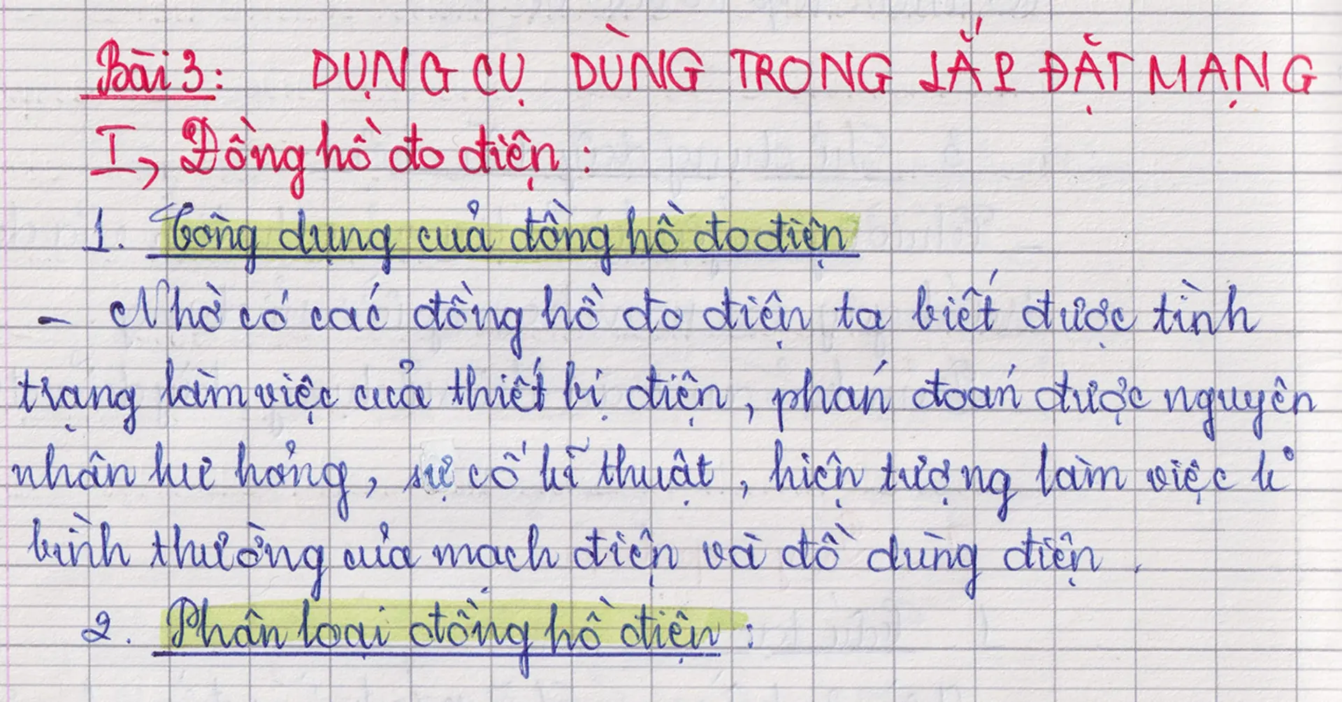
Compared to the bold and heavy forms of Cooper Black, cursive letters have always caught my eye and piqued my interest in letterforms. In Vietnamese culture, cursive writing is highly valued and regarded as an important skill that all students must master. We were taught to practice Ronde and Copperplate scripts, which are the standard styles prescribed by the Bộ Giáo dục và Đào Tạo (Ministry of Education & Training). Handwriting contests for students are held at both school and district levels. I loved nothing more than competing and showing off my skills at these events. To win the top prize, I spent hours perfecting each letter, pressing my hand to produce perfect downstrokes until I had the “nerd bump” The criteria for winning was having the right letter proportions, the right stroke thickness, and the correct angle for each letter.

My handwriting in Grade 9, (2010).
I was also curious about the differences between printed letters in textbooks and handwritten letters. Why is the printed ‘b’ just a vertical line combined with a circle, while the handwritten ‘b’ contains so many loops and sometimes includes thin upstrokes and thick downstrokes?
Sharing the same interest in handwriting letters, my typography collective, Lưu Chữ, has worked together on a research article discussing the origin and evolution of Vietnamese handwriting styles.
The Vietnamese writing system
Hán and Nôm scripts
Throughout its history, the Vietnamese writing system has undergone three significant changes. The first was the Classical Chinese system (chữ Hán or chữ Nho), as Chinese dynasties played a significant role in shaping Vietnamese culture and literature. Subsequently, Vietnamese scholars developed their own writing system, chữ Nôm, based on Chinese ideographs. However, this writing system was used exclusively by the elite and privileged; records indicate that only 0.05% of the population could understand it (1).
The emergence of Latin script
The introduction of the Latin alphabet in Vietnam during the 17th century brought significant changes. It was initiated by Catholic missionaries who wanted to transcribe religious texts for new converts (2). This allowed a broader population, including those who could not read Nôm ideographs, to have access to the texts. Later on in the late 19th century, the writing system was adopted in social fields because it was easy to learn, remember and use for daily communication, thanks to its “speak as you write” maxim. This made it easier to spread the writing system compared to the previous Hán and Nôm scripts. France, at that time, implemented a policy in the South of Vietnam that required all administrative documents to be presented in the Quốc Ngữ script. Schools were also required to teach reading and writing in Quốc Ngữ alongside French. The aim was to completely eliminate the use of Hán and Nôm scripts in the South. Similar regulations were applied in the North and Central regions in the early 20th century.
The revolution against the Enemy of Illiteracy
From 1938 to 1945, Vietnamese intellectuals promoted the use of the Vietnamese alphabet. This included the “Bình Dân Học Vụ” movement, which aimed to teach literacy to people of all ages. Prior to the movement, only 3% of Vietnamese children and 2% of adults were literate. However, after the first year of the movement, over 2.5 million people learned how to read and write. By 1950, nearly 12.2 million people (around 49.1% of Vietnam's population at the time) were literate (3). One of the advisory members of the Society for the Propagation of the Vietnamese Alphabet, Hoàng Xuân Hãn, invented the “Method: I-tờ” to make learning to read and write easier (4). This method used luc-bat verses to differentiate the characteristics of each letter.
(Vietnamese)
i, t(tờ), có móc cả hai.
i ngắn có chấm, t(tờ) dài có ngang;
e, ê, l(lờ) cũng một loài.
ê đội nón chóp, l(lờ) dài thân hơn;
o tròn như quả trứng gà.
ô thì đội mũ, ơ là thêm râu
o, a hai chữ khác nhau
vì a có cái móc câu bên mình.
(English)
i and t both have a tail.
i is short with a dot, t is long with a crossbar
e, ê, l are the same kind.
ê wears a conical hat, l's body is longer;
o is round like an egg.
ô wears a hat, while ơ sports a moustache.
o, a are two different letters
'cause a has a hook on the side.
The official Vietnamese handwriting model

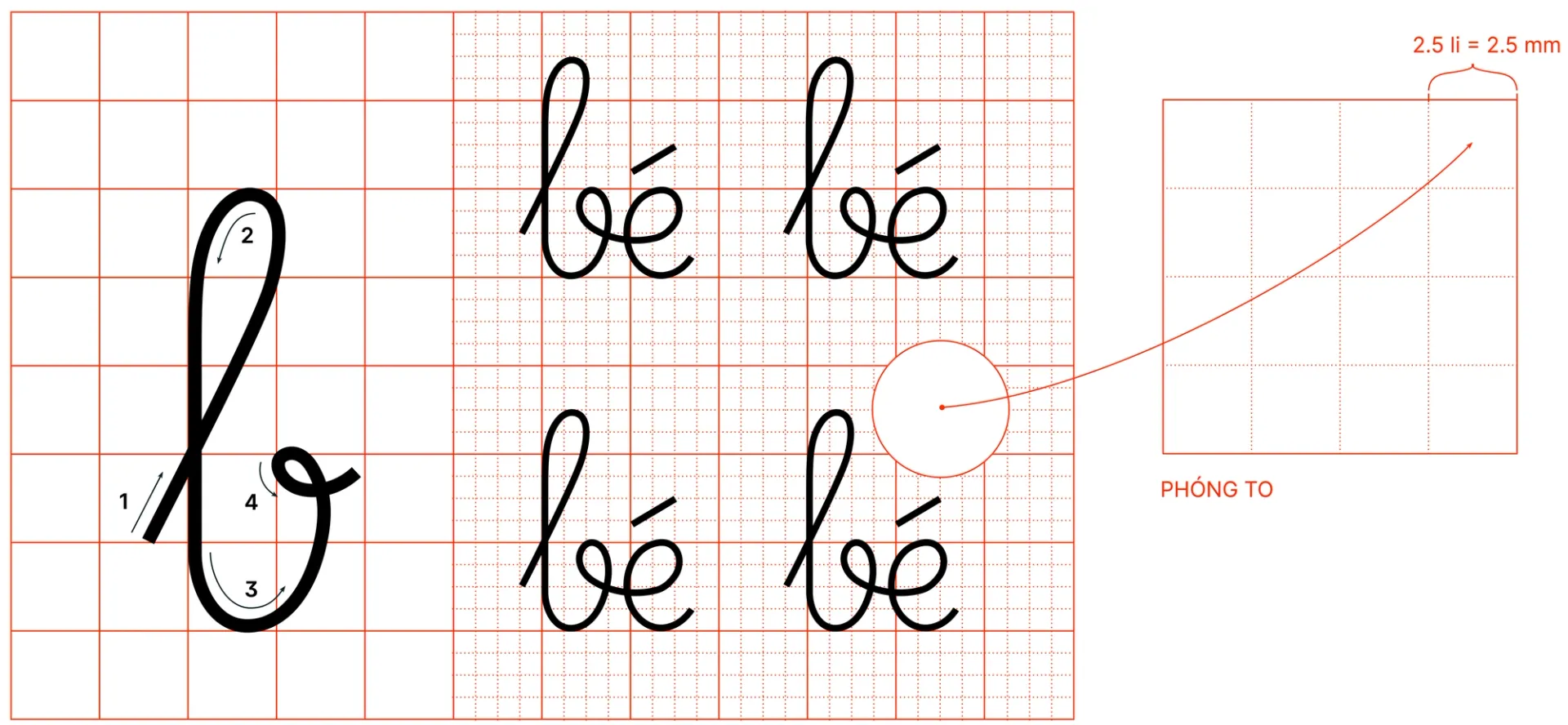
The French ruling grid uses a square grid with letters to determine writing procedures. Each unit of height or width consists of 4 small squares with font samples. The Writing Set, suitable for children learning to write, has one square equivalent to 2.5 mm. In student notebooks, where familiarity with letter shapes has been achieved, this size is reduced to 2 mm. (Image used in Lưu Chữ's research article “Ai cũng có thể viết được chữ đẹp / Anyone can learn to write beautifully”.)
Why the upright style? In “The Art of Writing,” Bùi Bá Nghệ notes that Germany and England had national writing education programs in the late 1890s and early 1900s. John Jackson introduced the Upright script as a replacement for the Italic script, which had been used previously. The Upright script is easier to write because of the upright posture and focus on the distance between the notebook and the writer's eyes. Although there is debate about the change, some argue that the Upright script is shorter, requiring less hand movement than the Italic script and therefore saving time. The Upright script represents an important milestone in the transition of students' handwriting in Europe and is still used in Vietnam today.

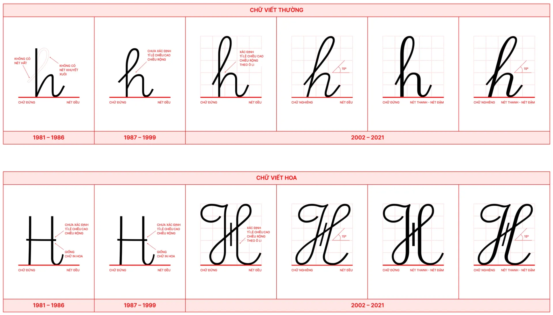
The process of changing the letter H, presented in lowercase and uppercase writing styles from 1981 to 2021. (Image used in Lưu Chữ's research article “Ai cũng có thể viết được chữ đẹp / Anyonew can learn to write beautifully”.)
Cursive writing has been with me since the early days of my journey as a type designer. It has greatly influenced the way I create letters, leading me to favour tall ascenders. This influence can be seen in the early stages of my reverse-contrast typeface, Umbrella. It can also be seen in the single-storey “a” and“i” with tails in my Mighty Mono, as I continued to explore the possibilities of cursive writing.

A sample of my typeface Umbrella, drawn during a workshop with Vincent Chan (2018).

A sample of Mighty Mono, a typeface I started to draw during my master’s research project (2019).
After my exploration of Cooper Black and cursive writing in Vietnam, I am intrigued to delve deeper into the relationship between handwriting and type design. I often reflect on Gerrit Noordzij's definition of typography as “writing with prefabricated characters”. His argument that most printing typefaces and type design have roots in handwriting is fascinating and thought-provoking. According to Noordzij, handwriting reveals the logical construction of letters, especially through the translation, expansion, and rotation that occurs when writing with a pen.(5) I am excited to explore this connection further, particularly in the context of Eastern culture. In some ways, Eastern culture is 'same, same but different' from Western culture.
References
1 — Quỳnh, Z.M.(2022) Quốc ngữ: The Shackle that became the sword, DVAN. Available at: https://dvan.org/2022/03/quoc-ngu-south-vietnam (Accessed: April 22, 2023).
2 — Fernandes, Gonçalo & Assunção, Carlos.(2017). First codification of Vietnamese by 17th-century missionaries: The description of tones and the influence of Portuguese on Vietnamese orthography. Histoire Epistémologie Langage. 39. 155–176. 10.1051/hel/2017390108.
3 — Chuyện về phong trào diệt giặc dốt 70 năm trước(no date) Laodong.vn. Available at: https://laodong.vn/archived/chuyen-ve-phong-trao-diet-giac-dot-70-nam-truoc-697946.ldo (Accessed: April 22, 2023).
4 — Hoàng, H.X.(1988)Nhớ lại hội truyền bá quốc ngữ, Diễn Đàn Forum. Available at: https://www.diendan.org/tai-lieu/doan-ket/nho-lai-hoi-truyen-ba-quoc-ngu (Accessed: April 22, 2023).
5 — Noordzij, G. and Enneson, P.(2019)‘6’, in The stroke: Theory of writing. Amsterdam: Uitgeverij de Buitenkant, Royal Academy of Art.